
I remember sitting in my old agency cubicle, staring at a screen full of “revolutionary” design templates that promised ease but delivered nothing but a headache. Everyone was talking about complex, high-end layouts as if they were some kind of sacred mystery, but honestly? Most of that hype is just noise designed to make you feel like you can’t do it yourself. When I first started working with web design grid systems, I thought I needed a math degree to make things line up. In reality, a grid isn’t some impenetrable wall of code; it’s just a simple invisible skeleton that keeps your content from drifting aimlessly across the screen.
I’m not here to sell you on a fancy new software subscription or drown you in academic jargon. My goal is to pull back the curtain and show you how I actually use these tools to build clean, professional sites from my home office. I’ll walk you through the practical side of web design grid systems so you can stop guessing where to place your images and start building a site that actually makes sense to your visitors. No fluff, no gatekeeping—just the straight truth.
Table of Contents
Mastering Column Width and Gutter Spacing Without the Headache

When you start playing with your layout, the math can get a little intimidating. You’ll hear people throwing around terms like “pixel-perfect,” but honestly, you just need to find a balance between your content and the “breathing room” around it. This is where column width and gutter spacing come into play. Think of your columns as the containers for your actual information—your text, your photos, your call-to-action buttons—and the gutters as the empty hallways between them. If your gutters are too narrow, your site feels cramped and claustrophobic; if they’re too wide, your content looks disconnected and lonely.
I usually suggest starting with a simple approach rather than overcomplicating things. You don’t need to master every complex mathematical ratio on day one. Instead, decide whether you want a fixed grid, where everything stays a set size, or a fluid vs fixed grids approach, where your layout stretches and shrinks to fit different screens. For most of the small business sites I build, a fluid approach is a lifesaver because it keeps things looking intentional whether someone is viewing your site on a giant desktop or a tiny smartphone.
Why Visual Hierarchy in Web Design Matters for Everyone
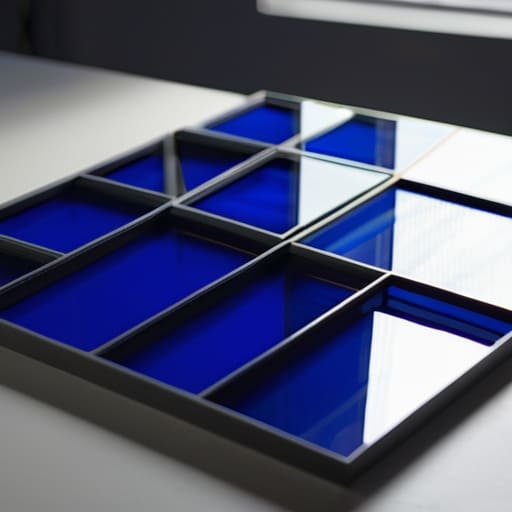
Think of your website like a physical storefront. If every single item—the sale sign, the mannequin, and the price tags—is the exact same size and color, your customers won’t know where to look first. They’ll just feel overwhelmed and walk out. This is exactly why visual hierarchy in web design is so vital. It’s the art of telling your visitor’s eyes, “Hey, look at this first, then move here.”
When you use a solid structure, like modular grid layouts, you aren’t just making things look pretty; you’re creating a roadmap. A good grid allows you to play with scale. You can make a headline massive and bold to grab attention, while keeping your body text clean and easy to read. Without this intentional layering, your site ends up looking like a cluttered junk drawer where everything is fighting for dominance. By establishing a clear order of importance, you make your site actually usable instead of just a collection of random boxes and images.
5 Ways to Use Grids Without Losing Your Mind
- Stick to a standard 12-column grid whenever you can. It’s the industry standard for a reason—it’s flexible enough that you can easily split your layout into halves, thirds, or quarters without doing any awkward math.
- Don’t forget about your gutters. Those little spaces between your columns are what keep your content from looking like a cluttered wall of text; if they’re too narrow, your site will feel claustrophobic.
- Design for your smallest screen first. I always start with a single-column layout for mobile, then use the grid to expand the content as the screen gets wider. It’s much easier than trying to “shrink” a complex desktop layout.
- Use your grid to create “white space” intentionally. A grid isn’t just for where things go; it’s also for where things don’t go. Leaving empty columns can give your most important buttons or images room to breathe.
- Avoid the temptation to break the grid on every single page. A little bit of asymmetry can look cool, but if you ignore your grid lines constantly, your website will end up looking accidental rather than intentional.
The Bottom Line: Making Grids Work for You
Don’t get paralyzed by the math; a grid is just a tool to keep your layout from looking like a cluttered junk drawer.
Use your gutters and columns to create breathing room, because white space is what actually makes your content readable.
Focus on hierarchy over perfection—use your grid to guide the eye to what matters most, rather than just filling up empty boxes.
The Real Purpose of a Grid
A grid isn’t some complex mathematical puzzle you need to solve to look professional; it’s just a quiet framework that keeps your content from feeling like a cluttered junk drawer.
Lucia Ferreira
Putting the Pieces Together

At the end of the day, a grid system isn’t some complex mathematical formula designed to gatekeep web design from you. It’s just a framework to help you make sense of the chaos. We’ve talked about how mastering your column widths and gutters prevents that “cluttered” feeling, and why establishing a clear visual hierarchy ensures your visitors actually find what they’re looking for. When you stop guessing where to place your images and text and start leaning on a structured layout, you stop fighting your website and start actually building it. It’s about moving from a state of constant tweaking to a state of intentional design.
I know that staring at a blank screen or a messy layout can feel incredibly overwhelming, especially when you don’t have a CS degree behind you. But remember, the goal isn’t perfection; it’s clarity. You don’t need a massive agency budget or a suite of expensive tools to create a digital space that feels professional and organized. Once you grasp these basics, you’ll realize that you have much more control over your corner of the internet than you thought. So, grab your notebook, pick a simple grid, and just start building. You’ve got this.
Frequently Asked Questions
Do I really need to use a grid, or can I just wing it with my layout?
Look, I get it. When you’re staring at a blank canvas, “winging it” feels faster. But here’s the reality: without a grid, you’re essentially playing a game of digital Tetris where the pieces don’t quite fit. You might get lucky once, but your site will eventually feel “off” to visitors. A grid isn’t about restricting your creativity; it’s about giving you a reliable foundation so you aren’t constantly guessing where things belong.
How do I make sure my grid looks good on both a giant monitor and a tiny smartphone?
This is where most people get stuck, but it’s actually simpler than it looks. You don’t want to build two different websites; you want one that stretches and shrinks. Use a “fluid” approach. Instead of setting fixed pixel widths, use percentages or CSS Grid. This allows your columns to breathe. On a desktop, you might have four columns side-by-side, but for a smartphone, you just tell those columns to stack vertically. It’s all about stacking, not shrinking.
Is it better to use a standard 12-column grid, or should I create something custom for my specific site?
Honestly? Stick with the 12-column grid for now. I know “custom” sounds more professional, but in my experience, it’s usually just a recipe for a massive headache when you try to make the site responsive. A 12-column system is incredibly flexible because it’s divisible by 2, 3, 4, and 6. It gives you enough math-free options to build almost any layout without reinventing the wheel every time you add a new page.
