I remember sitting in my old agency office, staring at a client’s “award-winning” website that looked like a neon fever dream but was completely impossible to navigate. It was beautiful, sure, but nobody could actually find the “Contact Us” button. That’s when I realized that most people treat ui ux design like it’s some mystical, expensive art form reserved for Silicon Valley giants. In reality, it’s not about flashy animations or following every single fleeting trend; it’s about making sure a human being can get from point A to point B without wanting to throw their laptop across the room.
I’m not here to sell you on complex design frameworks or convince you that you need a six-figure budget to get this right. Instead, I want to pull back the curtain and show you how to build digital spaces that actually make sense for your users. We’re going to break down the fundamentals of ui ux design into practical, manageable steps that you can apply to your own projects. My goal is to help you create a website that is functional, intuitive, and honest, so your visitors spend less time guessing and more time connecting with what you do.
Table of Contents
Mastering the User Centered Design Process Without the Fluff
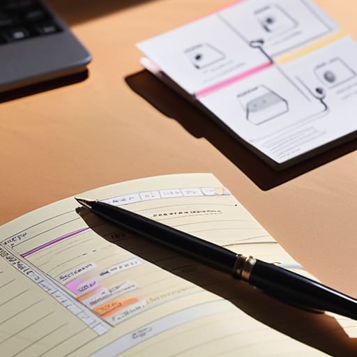
When I first started freelancing, I used to think design was all about picking the perfect color palette or a trendy font. I was wrong. Real design happens long before you touch a single pixel. It starts with a solid user-centered design process, which is really just a fancy way of saying you need to stop guessing what people want and actually start listening to them. You have to step out of your own head and figure out the specific problems your visitors are trying to solve.
Once you actually understand those needs, you move into the “blueprint” phase. This is where prototyping and wireframing come into play. Think of it like sketching a floor plan before you start buying expensive furniture; you’re just trying to map out where things go so the layout makes sense. I always tell my clients that if the skeleton of the site is clunky, no amount of pretty imagery will save it. It’s about building a logical flow that feels intuitive, not a digital obstacle course that leaves your users feeling frustrated and lost.
Using Visual Hierarchy in Interface Design to Guide Users
Think of visual hierarchy as the roadmap for your visitor’s eyes. When someone lands on your site, they shouldn’t have to play a game of “where do I click next?” Using visual hierarchy in interface design is really just about telling people what matters most. You do this through scale, color, and spacing. If everything on your page is shouting for attention—bold colors, huge fonts, giant buttons—then nothing actually stands out. It’s like being in a room where everyone is talking at once; eventually, you just tune it all out.
To get this right, you need to be intentional with your layout. I always tell my clients to start with the most important action, like a “Sign Up” button, and give it the most visual weight. You can use whitespace to create breathing room, which helps prevent that overwhelming feeling. This isn’t just about making things look pretty; it’s a core part of effective interaction design principles. By guiding the eye naturally from the headline to the primary call-to-action, you’re making the experience feel intuitive rather than a chore.
5 ways to keep your design from getting in its own way
- Prioritize function over “fancy.” I see so many beautiful websites that are a nightmare to actually use. If a button looks like a piece of art but nobody knows it’s clickable, you haven’t designed a website; you’ve designed a digital museum. Keep it intuitive.
- Respect the user’s cognitive load. Don’t make people think too hard to find what they need. If I have to hunt through three different menus just to find your contact page, I’m leaving. Keep your navigation clean and your paths predictable.
- Use whitespace as a tool, not empty space. A cluttered screen is a stressful screen. Giving your elements room to breathe isn’t “wasting space”—it’s actually helping the user focus on what matters most, like your call-to-action or your main content.
- Consistency is your best friend. If your “Submit” button is rounded and blue on one page, don’t make it square and green on the next. When you stay consistent with your colors, fonts, and button styles, you build trust and help users learn how to interact with your site.
- Test it on a real device, not just your big monitor. It’s easy to get caught up in how everything looks on a high-res desktop, but most of your visitors will be on a phone while they’re multitasking. If it doesn’t work under a thumb on a small screen, it doesn’t work.
The bottom line on good design
Focus on the human on the other side of the screen; if your design doesn’t solve a real problem or make a task easier, it’s just decoration.
Use visual hierarchy to tell people where to look first, rather than hoping they’ll figure out your layout on their own.
Keep things simple and functional—you don’t need flashy, complex animations to build a professional site that people actually enjoy using.
## Design is more than just looking pretty
“At the end of the day, UI/UX isn’t about making something look ‘cool’ or following the latest trend; it’s about making sure your visitor doesn’t feel lost the moment they land on your page. Good design is invisible—it just works.”
Lucia Ferreira
Making it Stick
At the end of the day, good UI/UX design isn’t about chasing the latest flashy trends or using complex software that requires a PhD to operate. It’s about the fundamentals we’ve discussed: keeping your design process centered on the actual person sitting behind the screen and using visual hierarchy to make sure they never feel lost. When you strip away the jargon, design is really just about removing friction. Whether you are organizing your layout or choosing your color palette, every single decision should serve the goal of making your site intuitive and easy to navigate. If a user has to stop and think about where to click next, the design has already failed them.
Building a digital space can feel incredibly intimidating, especially when it feels like the tech world is constantly moving the goalposts. But remember, you don’t need to be a master designer to create something meaningful. You just need to care about the people who will visit your corner of the internet. Start small, keep things functional, and don’t be afraid to iterate as you learn what works for your specific audience. Your goal isn’t perfection; it’s accessibility and clarity. Go out there and build something that actually works for real people.
Frequently Asked Questions
Do I really need to learn complex design software like Figma, or are there simpler tools for someone just starting out?
Look, I get it. Opening Figma for the first time feels like sitting in the cockpit of a jet when you just wanted to ride a bike. You don’t need to master every complex tool to build something beautiful. If you’re just starting, try something like Canva or even basic wireframing on paper. Focus on the layout and the flow first. Once you understand why a button goes where it does, then you can worry about the heavy-duty software.
How do I know if my design is actually "good" or if I'm just making it look pretty?
The quickest way to tell is to stop looking at your screen and start watching people use it. If you have to step in and say, “No, click that button instead,” your design has failed, no matter how clean it looks. A “pretty” site is just digital wallpaper; a good design is invisible because it helps people finish their tasks without having to think. If they’re getting stuck, it’s time to prioritize function over aesthetics.
What's the actual difference between UI and UX in a real-world project—can I just focus on one?
Think of it like building a house. UX is the blueprint—it’s where the doors go, how the rooms flow, and making sure the kitchen isn’t miles away from the dining room. UI is the interior design—the paint colors, the light fixtures, and the textures. You can’t really ignore one for the other. A beautiful house (UI) is useless if you can’t find the bathroom, and a functional house is miserable if it’s ugly to live in.
