
I remember sitting in my old agency cubicle, staring at a client’s request for a “disruptive, high-energy palette,” only to realize they were basically asking me to build a website that would give their users a migraine. There is this massive, unnecessary myth that you need a deep background in fine arts or a massive budget to master web design color theory. People make it sound like some mystical science involving complex mathematical equations and expensive design software, but honestly? Most of that is just noise designed to make the process feel more intimidating than it actually is.
I’m not here to lecture you on the physics of light or throw academic jargon at your head. Instead, I want to show you how to use color to actually guide a visitor’s eyes and build trust without breaking your spirit (or your bank account). We are going to strip away the fluff and focus on practical, real-world application. By the time we’re done, you’ll know exactly how to pick a palette that looks professional and, more importantly, actually works for the people visiting your site.
Table of Contents
Using Color Wheel Applications in Ui Without the Confusion

When you first look at a color wheel, it can feel like a math problem you didn’t sign up for. But honestly, you don’t need to be a mathematician to use color wheel applications in UI effectively. I usually tell my clients to start simple. If you want a look that feels cohesive and calm, try monochromatic vs analogous color schemes. An analogous approach—picking colors that sit right next to each other on the wheel—creates a natural flow that doesn’t strain the eyes. It’s much easier to manage than trying to force a dozen different shades into one small layout.
On the flip side, if you have a button that absolutely must grab attention, that’s when you look at complementary color schemes for websites. This is where you pick colors from opposite sides of the wheel to create high energy. However, there is a massive catch: don’t let “pretty” override “usable.” I always keep my notebook handy to double-check accessibility and color contrast ratios before I finalize a design. If your text is too pale against a bright background, your users will just bounce, no matter how cool the palette looks.
Finding Hex Code Color Combinations That Actually Look Good

I’ve spent more hours than I’d like to admit staring at my physical notebook, trying to figure out why a specific shade of teal looked great on my monitor but felt “off” once I actually applied it to a layout. The truth is, picking hex code color combinations isn’t just about finding colors that look pretty next to each other; it’s about finding a balance that doesn’t strain the eyes. I usually start by picking one “hero” color—the one that represents the brand’s soul—and then I build everything else around it.
If you want to keep things simple, I highly recommend playing with monochromatic vs analogous color schemes. Monochromatic is my go-to when I want a site to feel calm and cohesive, like a well-tended garden. Analogous schemes feel a bit more vibrant and energetic. However, don’t get so caught up in the aesthetics that you forget about usability. Always double-check your accessibility and color contrast ratios before you commit. There is nothing worse than a beautiful, minimalist site that is completely unreadable for someone with visual impairments.
5 Real-World Rules for Picking Your Site's Palette
- Don’t let one color do all the heavy lifting. I always follow the 60-30-10 rule: 60% for your primary neutral, 30% for your secondary color, and just 10% for that punchy accent color that draws the eye to your buttons.
- Test your contrast before you commit. It sounds technical, but it’s actually just about making sure your text doesn’t disappear into your background. If your users have to squint to read your “About Me” page, they’re going to leave.
- Keep your “action colors” consistent. If your “Buy Now” button is a specific shade of teal, don’t suddenly make your newsletter signup a bright orange. Your users’ brains rely on that visual pattern to know where to click.
- Use neutrals to give your eyes a break. A common mistake I see is people trying to make every single inch of a website colorful. You need plenty of white space or soft greys to act as a buffer so your main colors can actually pop.
- Check your colors in different lighting. Since I spend a lot of time staring at screens, I’ve learned that a color that looks great in my bright home office might look totally different on a phone screen outdoors. Always check your site on mobile to see if the vibe holds up.
The Bottom Line: Making Color Work for You
Don’t get paralyzed by the math of the color wheel; focus on how colors interact to create a mood that matches your brand’s personality.
Use high-contrast combinations for your most important buttons and links so your users never have to hunt for where to click next.
Keep your palette lean by picking a few reliable hex codes and sticking to them, rather than trying to use every color in the rainbow.
## Why Color Theory Matters
“Color theory isn’t about memorizing a complex wheel or following arbitrary rules; it’s about making sure your visitors feel exactly what you want them to feel the second your page loads.”
Lucia Ferreira
Bringing It All Together
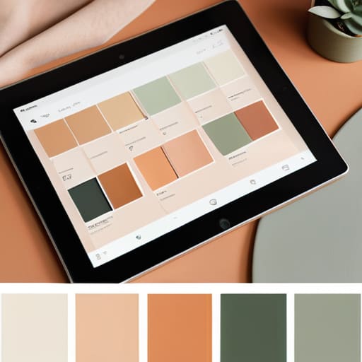
At the end of the day, color theory isn’t about memorizing complex mathematical formulas or following every single rule in a textbook. It’s about understanding how to use tools like the color wheel and hex code palettes to create a space that feels cohesive and intentional. We’ve looked at how to navigate those color wheels without getting a headache and how to find combinations that actually hold up when they hit a real screen. Remember, your goal isn’t to create a masterpiece that belongs in a museum; it’s to build a digital environment where your visitors feel comfortable and can easily find what they need. Keep it simple, keep it functional, and don’t be afraid to iterate.
I know that staring at a blank canvas of hex codes can feel incredibly intimidating, especially when you’re trying to build something from scratch. But please, don’t let the fear of “doing it wrong” stop you from launching. The internet is your playground, and your website is your own little corner of it. You don’t need a massive design budget or a degree in fine arts to make something that looks professional and welcoming. Just take it one shade at a time, trust your instincts, and remember that the best designs are the ones that serve the person on the other side of the screen. You’ve got this.
Frequently Asked Questions
How do I make sure my chosen colors don't make my text impossible to read for people with visual impairments?
This is where things get real. It’s one thing to pick colors that look pretty on your screen, but it’s another thing entirely to make sure they’re actually usable. If your text-to-background contrast is too low, you’re effectively locking people out of your site. I always recommend using a WCAG contrast checker tool. It’s a simple way to ensure your text pops enough for everyone to read it, regardless of their vision.
Is there a way to pick a color palette that doesn't look like a generic template?
The easiest way to avoid that “off-the-shelf” template look is to stop looking at color generators and start looking at the real world. I always keep a notebook of hex codes handy because I find inspiration in things like a vintage synth’s casing or the specific green of a new leaf in my garden. Grab a photo you love, pick a few dominant tones, and build from there. It feels much more intentional.
How much of my brand's personality should actually come from color versus just using a neutral background?
Think of color as your brand’s seasoning, not the entire meal. If you go too heavy on bold colors, you risk overwhelming your visitors—it’s like eating a dish that’s nothing but salt. I usually recommend letting a clean, neutral background do the heavy lifting for readability. Use your brand colors strategically for things that actually matter, like buttons or headings. That way, your personality pops without making your site feel cluttered or unprofessional.
