
I remember sitting in my old agency cubicle, staring at a $5,000 invoice for a “comprehensive brand identity package” that essentially boiled down to a fancy logo and a handful of color swatches. It felt like a total scam, and honestly, it still does. Most people think you need a massive marketing budget or a degree in design to create a cohesive online presence, but that’s just noise. You don’t need a bloated agency to tell you who you are; you just need a practical website branding guide that helps you stay consistent without draining your bank account.
I’m not here to sell you on some “secret sauce” or high-level corporate strategy that sounds good in a boardroom but fails in the real world. Instead, I’m going to walk you through the actual essentials—the stuff that makes your site feel like a real place rather than a generic template. We’re going to talk about colors, fonts, and voice in a way that actually makes sense for your business. My goal is to give you a straightforward roadmap so you can stop guessing and start building a corner of the internet that truly feels like you.
Table of Contents
Mastering Brand Identity Design Principles Without the Hype
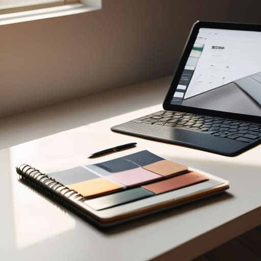
When people hear “design principles,” they often imagine expensive agencies and complex mood boards. But honestly? It’s much simpler than that. At its core, mastering brand identity design principles is just about making sure your website doesn’t feel like a disorganized junk drawer. You want a cohesive look that tells your visitors exactly who you are before they even read a single sentence. This starts with your visual foundation: choosing a typography and color palette for web that is actually readable. I always tell my clients to pick colors that evoke the right mood, but more importantly, ensure they have enough contrast so your visitors aren’t squinting at their screens.
Beyond the colors, you need to think about how your brand actually behaves in a digital space. This is where user experience and brand perception collide. If your site is slow, cluttered, or uses a font that looks like a ransom note, people will subconsciously trust you less. It’s not about being “flashy”; it’s about being consistent. Whether it’s how you use your logo or the specific tone you use in your copy, every small detail should feel like it’s coming from the same person.
Picking Your Typography and Color Palette for Web

When you start picking your colors and fonts, it’s easy to get lost in the endless sea of options. I’ve seen so many small business owners pick colors because they “look pretty,” only to realize later that their text is impossible to read on a mobile screen. When you’re choosing your typography and color palette for web, remember that functionality always comes first. I always suggest picking one primary color, one secondary color, and a neutral shade for backgrounds. This keeps things clean and prevents your site from looking like a digital fever dream.
The same goes for your fonts. You don’t need ten different typefaces; you really only need two. A solid choice is a distinct heading font paired with a highly readable body font. This isn’t just about aesthetics; it’s about user experience and brand perception. If your font is too decorative, people will struggle to find the information they need, and they’ll leave. Once you’ve settled on these elements, I highly recommend jotting them down in a simple digital brand guidelines template. It saves you from the headache of guessing which hex code you used six months down the road.
Five Ways to Keep Your Brand Consistent (Without Losing Your Mind)
- Write down your brand voice in plain English. Are you the helpful neighbor or the expert consultant? Decide now so you aren’t switching tones every time you write a new blog post or product description.
- Create a “cheat sheet” for your visual assets. I keep a physical notebook for my hex codes, and I highly recommend you keep a digital one too. Having your exact colors and fonts in one place stops you from “guessing” every time you open a new design tool.
- Stick to a limited set of imagery styles. Whether you use grainy film photography or clean, minimalist illustrations, pick one vibe and stay there. Mixing random stock photos with custom art makes your site feel like a digital junk drawer.
- Don’t let your logo do all the heavy lifting. A logo is just a tiny anchor; your brand is actually felt through your spacing, your button styles, and even how you phrase your call-to-action buttons.
- Test your brand on different screens. A color palette that looks stunning on my high-end monitor might look muddy on a budget smartphone. Always check that your “brand identity” actually translates to the real world where your customers are browsing.
The Bottom Line: Making it All Stick
Don’t get paralyzed by choice; pick a handful of colors and two reliable fonts, then stick to them so your site actually feels cohesive.
Your brand isn’t just a pretty logo; it’s the way you talk to your visitors and the way your website makes them feel.
You don’t need a massive design budget to look professional, just a clear sense of who you are and a little bit of visual consistency.
The Real Purpose of Branding
“A website branding guide isn’t some sacred document for designers to argue over; it’s just a simple set of rules to help you show up consistently so your visitors actually know who you are and why they should trust you.”
Lucia Ferreira
Bringing It All Home
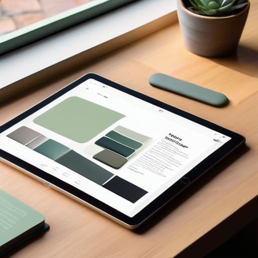
At the end of the day, building a brand isn’t about having the most expensive designer or the flashiest animations on your landing page. It’s about the small, intentional choices we’ve talked about: picking a color palette that doesn’t strain the eyes, choosing fonts that are actually readable, and ensuring your visual identity stays consistent from your header down to your footer. When you strip away the noise, branding is really just about creating a sense of familiarity for your visitors. If you can master these basics, you’ve already done more than most small business owners to establish a professional, trustworthy presence online.
I know that staring at a blank CMS or a fresh CSS file can feel incredibly daunting, but please remember that your brand is a living thing. It doesn’t have to be perfect on day one, and it certainly doesn’t need to be finished before you launch. Your website is your digital home, and like any home, you can slowly make it your own as you grow and learn what works for you. Don’t let the fear of “getting it wrong” stop you from claiming your corner of the internet. Just start building, stay consistent, and keep it simple.
Frequently Asked Questions
How do I know if my brand colors and fonts actually work together before I commit to them on my whole site?
Don’t commit to anything just by looking at a static image on a screen. That’s how you end up with a site that feels “off” once it’s live. Instead, build a quick, “ugly” prototype. Throw your colors and fonts into a basic layout with real text—not just Lorem Ipsum. If the hierarchy feels messy or your eyes get tired reading the paragraphs, your combination isn’t working. Test it in a real browser environment first.
Do I really need a professional logo, or can I get away with something simpler while I'm still growing?
Honestly? No, you don’t need a high-priced logo designer right out of the gate. When you’re starting small, a clean, well-chosen typeface for your name can work just as well as a complex icon. What matters more than a fancy symbol is consistency. If you pick a simple look and stick to it across your site and socials, you’ll look professional enough to build trust while you’re still finding your footing.
Once I decide on my branding, how do I make sure it stays consistent across my website and my social media pages without it being a massive chore?
The secret isn’t more work; it’s creating a “cheat sheet.” I keep a simple digital document—or even a physical notebook, like I do for my hex codes—that lists my exact brand colors, fonts, and even a few go-to image styles. When you’re jumping from your website editor to Canva for an Instagram post, don’t guess. Just grab your specs and copy-paste. Consistency becomes a habit rather than a chore when the rules are right in front of you.
