
I remember sitting in my old agency cubicle, staring at a client who was absolutely spiraling because they’d spent three thousand dollars on a high-fidelity mockup that didn’t even work for their users. They were obsessed with the exact shade of cerulean blue and the rounded corners of their buttons, but they hadn’t even thought about where the “Contact Us” button actually lived. It was a total waste of money, and honestly, it still makes my skin crawl. Most people think you need expensive software and a degree in visual arts to start, but that’s a lie. You don’t need fancy colors or perfect fonts to build a site that works; you just need web design wireframes that act as a simple, honest blueprint for your ideas.
In this guide, I’m stripping away the fluff and the expensive jargon. I’m going to show you how to use wireframing to map out your site’s bones before you ever touch a color palette or a piece of premium software. My goal is to give you a practical, no-nonsense way to organize your content so you don’t end up like my old client—wasting budget on pretty things that don’t actually serve your business.
Table of Contents
- Low Fidelity vs High Fidelity Wireframes Choosing What Actually Works
- Information Architecture Planning Without the Expensive Jargon
- Five Ways to Wireframe Without Losing Your Mind
- My Three Golden Rules for Wireframing
- The Real Purpose of a Wireframe
- Getting Started Without the Overwhelm
- Frequently Asked Questions
Low Fidelity vs High Fidelity Wireframes Choosing What Actually Works

When you’re starting out, you’ll likely run into the debate of low-fidelity vs high-fidelity wireframes, and honestly, it can feel like a distinction without a difference if you don’t know why they exist. I like to think of low-fidelity wireframes as the “napkin sketch” phase. These are rough, messy, and usually just boxes and lines drawn on paper or a basic digital canvas. The goal here isn’t to make things look pretty; it’s about information architecture planning. You’re just trying to figure out where the navigation goes and how a user actually gets from point A to point B without getting lost.
Once you’ve nailed that structural foundation, you move into high-fidelity territory. This is where things get a bit more granular. High-fidelity versions start to incorporate specific spacing, actual content, and a clearer sense of the user experience design process. It’s still not a finished website—don’t let anyone tell you it is—but it’s a much more precise digital blueprint that helps you spot potential friction points before you spend a single cent on expensive custom assets or complex coding.
Information Architecture Planning Without the Expensive Jargon
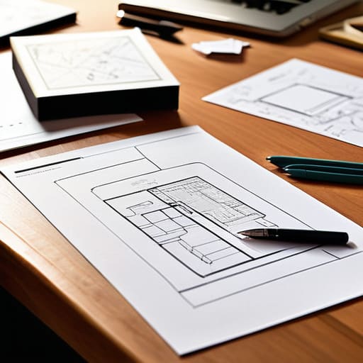
Before you even touch a design tool, you need to tackle information architecture planning. I know, that sounds like something a high-priced consultant would charge you thousands for, but it’s actually much simpler than the industry makes it out to be. Think of it as organizing your digital filing cabinet. You’re just deciding where things live so your visitors don’t get lost. If your navigation is a mess, it doesn’t matter how pretty your colors are; people will leave.
Instead of getting bogged down in complex ui design principles, just grab a stack of sticky notes or a piece of paper. Map out your main pages—Home, About, Services, Contact—and decide how they link together. This is the foundation of a solid user experience design process. By doing this manual heavy lifting first, you ensure your site actually makes sense to a human being, not just a search engine. It’s about creating a logical flow that guides people toward what they need without making them hunt for it.
Five Ways to Wireframe Without Losing Your Mind
- Don’t touch your computer yet. I know it’s tempting to jump straight into Figma or Adobe XD, but grab a cheap notebook and a pen. There is something about the friction of a physical pen that forces you to think about the layout rather than getting distracted by picking the perfect font or hex code.
- Focus on the “Why,” not the “Pretty.” A wireframe is a blueprint, not a painting. If you find yourself spending twenty minutes deciding where a button should go because of its color, stop. Ask yourself: “Does this button actually need to be here to help the user, or am I just decorating?”
- Use placeholder content early on. One of the biggest mistakes I see is people using Lorem Ipsum for everything. It’s easy to design a beautiful box, but it’s much harder to fit your actual, real-world text into that box later. Try to use rough versions of your actual headlines so you know if your layout actually holds up.
- Think in blocks, not pixels. When you’re mapping things out, stop worrying about whether an image is exactly 400 pixels wide. Instead, think in terms of hierarchy: “This is the hero section, this is the feature list, and this is the contact area.” It keeps the project manageable and prevents you from getting bogged down in the weeds.
- Test the “Thumb Flow” even on paper. If you’re designing a site that people will mostly use on their phones, draw your wireframes in a tall, narrow rectangle. It’s a simple way to make sure your most important buttons aren’t buried at the bottom of a screen where nobody will ever reach them.
My Three Golden Rules for Wireframing
Don’t get distracted by colors or fonts too early; focus entirely on where things go and how they work before you worry about making them pretty.
Use low-fidelity sketches as your starting point to save time and money, because it’s much easier to erase a pencil line than to redesign a polished digital layout.
Map out your user’s journey first, ensuring that every button and link actually serves a purpose in helping them get from point A to point B.
The Real Purpose of a Wireframe
A wireframe isn’t about making something look pretty; it’s about making sure the bones of your site are strong enough to hold the weight of your ideas before you spend a single cent on colors or fonts.
Lucia Ferreira
Getting Started Without the Overwhelm
At the end of the day, wireframing isn’t about creating a masterpiece; it’s about building a solid foundation so you don’t end up rebuilding your entire site three weeks from now because you forgot where the “Contact” button goes. We’ve looked at how to choose between low-fidelity sketches and high-fidelity prototypes, and how to organize your information so it actually makes sense to a human being, not just a search engine. Remember, the goal is to solve problems on paper before you ever touch a line of code or spend a dime on premium fonts. If you can map out the logic and the flow, the actual design phase becomes much more manageable and, frankly, a lot more fun.
I know that staring at a blank screen can feel intimidating, especially when it feels like there’s a “right” way to do everything in tech. But here is my honest advice: just start messy. Grab a physical notebook—the kind I keep my hex codes in—or a simple piece of paper and just start drawing boxes. You don’t need a computer science degree to understand how a person navigates a page. You just need a clear vision and the patience to iterate. You are building your own corner of the internet, and taking it one step at a time is the most professional way to do it.
Frequently Asked Questions
Do I really need to make a wireframe if I'm just building a simple one-page site?
Honestly? Even for a one-pager, I’d say yes. It’s tempting to just jump straight into your site builder and start dragging blocks around, but that’s usually how you end up with a cluttered mess. Think of a wireframe as a quick sketch on a napkin. It helps you decide where your call-to-action lives and how the flow feels before you waste time fiddling with fonts and colors. It saves you a headache later.
What tools should I use if I'm not a designer and don't want to pay for expensive software?
Honestly, you don’t need a hefty subscription to Figma or Adobe to get started. If you’re just mapping out ideas, a physical notebook and a sharp pencil are actually my favorite tools—they keep you focused on structure rather than getting distracted by colors. If you want to go digital, try Penpot; it’s open-source and free. Even Google Slides works surprisingly well for simple layouts. Just pick something that doesn’t get in your way.
How do I know when my wireframe is "finished" enough to actually start building the real site?
You’re finished when you can follow a user’s journey from landing on your homepage to completing an action—like buying a product or sending an email—without feeling lost. If you can look at your wireframe and clearly see where every button leads and what every headline is trying to say, you’re ready. Don’t aim for perfection; aim for clarity. Once the logic holds up, stop tweaking the boxes and start building.
